Wednesday, May 13, 2020

NFL New Look Review. Part 6: Los Angeles Rams

WTF?
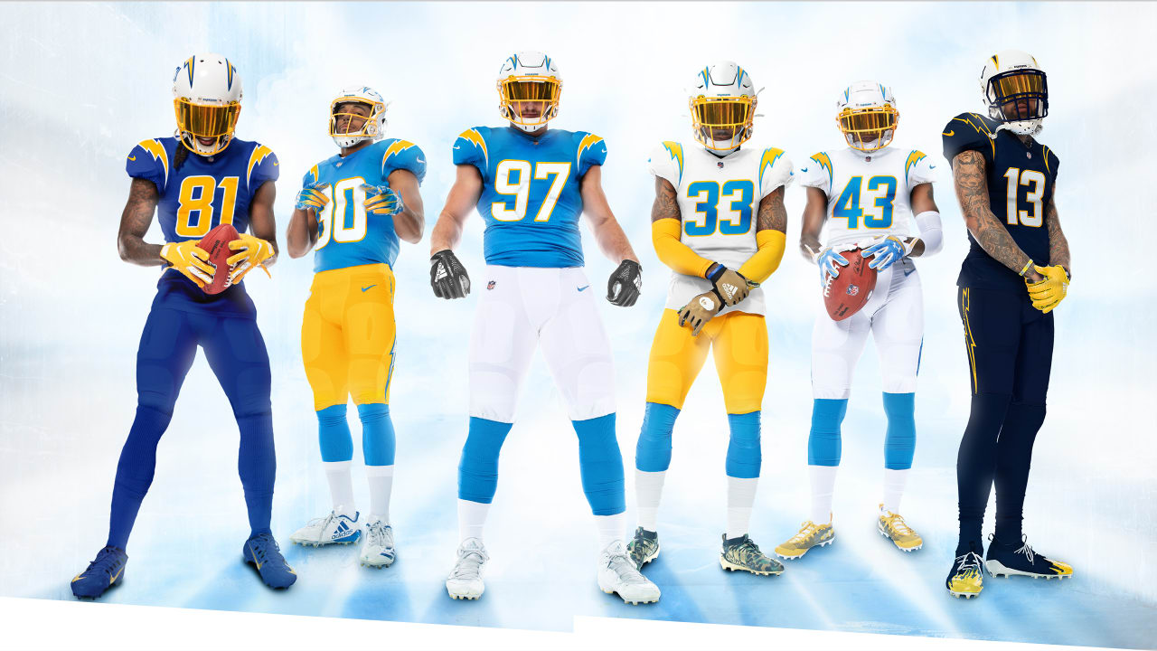
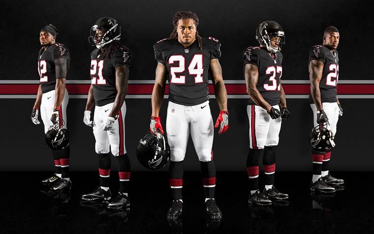
Throughout their history, the Cleveland, then Los Angeles, then St. Louis and then back the LA Rams have had a decent uniform history.  Even the navy blue and gold of the 2000's wasn't a terrible look.  Since their move back the LA, the Rams have sought to bring back their original colors.  They've toyed with the white logo on the helmet and the blue and yellow of the 80s and 90s.  The Blue and yellow look is what they went to two Super Bowls in and won one of them.  So when the Rams started to transition to that color scheme, I was excited.  They released their new logo which was disappointing to say the least, and now they have released their new uniforms, uniforms they'll have to wear for five years, five years.  The LA Rams have joined the Atlanta Falcons in designing uniforms that should go in the bin marked: "Shit that didn't work".   The new uniforms feature the blue and yellow, however, the helmet logo has changed to a new ram horn design, the numbers are a gradient style on the blue uniforms which transitions from yellow to white and the road uniforms are an off-white with blue numbers.  While the Rams have a great color combo and a uniform history that could easily be modernized or replicated, they decided to unveil something that looks like a bad attempt at designing a uniform on Madden create a team mode.
Eric Dickerson in an iconic look
Jim Everett in another favorite of mine
The Positives: There's not much to like here.  I guess the colors of the home uniform.  It's a great color combo.  That's about it.

The Negatives:  Ugh, where do I start?  The uniform looks like a horrible mid-major college uniform.  These uniforms make the Atlanta Falcons new uniforms look amazing.  The off white road uniform is abysmal and the helmet logo looks like that accidentally cut the stickers in half.  Additionally, the 'Los Angeles Rams" patches on the jerseys look horribly out of place.  Even the striping looks horrible.  There's really not much to like about these uniforms.

SMDH
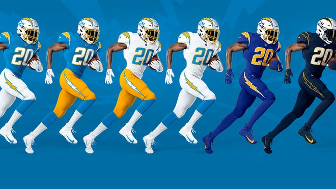
Final Thoughts:  While their neighbors from the AFC came out with an outstanding new uniform combo, the Rams did the exact opposite. This uniform looks like a cheap chinese knock off you find at a flea market.  It's poorly put together and I think the reason it took so long to unveil it was because they knew people would find it revolting.  The replies to their twitter announcement have made for some fun reading.  Hopefully in 5 years, these uniforms are given the same send off the Broncos' vertically striped socks got in 1962, thrown into a huge pile on the 50-yard line, doused in gasoline and set ablaze.

Grade:  F

Tuesday, May 12, 2020

NFL New Look Review. Part 5: Los Angeles Chargers


I wish I could say I was saving the best for last, but the Los Angeles Rams keep dragging their feel in unveiling their new uniforms.  However, the Chargers; who've always had a solid look, have outdone themselves.  In their newest rendition, the Chargers take us on a journey through their uniform past.  They have added numbers to the helmets which match the font of the uniforms.  The numbers bring back a modernized retro look, which I am a huge fan of.  Furthermore, the combo choices display the looks the Chargers had from their inception in 1960, to the present day.  The powder blue and yellow, the royal blue, then the navy blue of the late 80s and into the 2000s.  There aren't many teams that can say they've never had a horrible uniform, the Chargers can.  Have they been perfect throughout their history?  Absolutely not.  Their previous jerseys had the shoulder stripe with the lightning bolt that just didn't mesh well with the entire ensamble.  If that's the biggest complaint about their uniform history, they've had a good run.


The Positives: Just about everything.  I love the white helmet with yellow facemask and the numbers.  The panys are fanstastic with the simple lightning bolts with fit the color of the pants.  The color combos are awesome and their attention to their uniform history is something that I am really big on.  It's hard to have complaints about how they went about their look.  Additionally, I like the options they have.  Finally, the way they match the lightnight bolt on the helmet to the uniform combo is fantastic.  Everything works!


The Negatives:  Do I have to pick something?  I guess the navy blue uniforms are my least favorite, but they still look great.  It's hard to pick something I don't like.

Final Verdict: The Chargers got it spot on.  Everything ties in perfectly.  The colors work, they are consistent, they match.  While they may go 5-11 or 8-8, at least they'll be stylish!

Grade: A+


Thursday, April 30, 2020

NFL New Look Review. Part 4: New England Patriots

With the longest dynasty in NFL history seemingly coming to an end, the New England Patriots unveiled a change to the uniforms which they donned for 6 Super Bowl titles.  With Tom Brady gone, the Patriots are faced with their first season of uncertainty in 20 years.  As they begin a new era, the Patriots decided to give their regular look a facelift.  Gone is the blue and silver look, replaced with a predominently blue, red and white design.  While many Patriots fans were hoping for a return of Pat the Patriot, the team elected not to change the logo or the helmets.  While I do miss the old logo and red uniforms, it must be said that in the years they wore those uniforms, the Patriots managed just six playoff appearances and one trip to the Super Bowl, a 45-10 loss to the 1985 Chicago Bears. Thus, the "Flying Elvis" logo sticks around as a symbol of the success of the franchise. The new look isn't really a new look though.  The Patriots have decided replace the old uniforms with the color-rush design they had used previously.  A navy blue jersey sports red and white shoulder stripes and matching blue pants with a wide, white stripe with red lining.  The white jersey is the same design, with red and blue stripes and the same pants.  While I have yet to see a design with white pants, I would imagine they will unveil one.

Goodbye Tom, and those uniforms


The Positives:  The new Patriots uniforms have a much better color scheme than what they've worn before.  They've eliminated the silver from the uniforms and added more red and white to the navy blue.  They're also eliminated the single silver stripe from the shoulders, adding a cleaner looking red and white design.  The Patriots have also changed the number font to a more traditional block style. While there are many who dislike the shoulder stripes, I actually think they're an improvement on the previous uniforms.


The Negatives:  While the "Flying Elvis" logo is related to the success of the team, the Patriots helmets need an update.  The silver no longer goes with the current look.  While fans may not get Patthe Patriot back, a white helmet would look much better.  Even a navy blue helmet would be an improvement.  Finally, the pants do not match the uniforms. The stripes need to be consistent with the shoulder stripes on the jersey.  Unfortunately, they have a wide white stripe on the pants which makes the uniform look like they simply threw it together without attention to detail, very non-Belichick of them!  Fix the stripes on the pants and add a white option and they'll have a stronger look.  

Final Verdict:  While the change was needed, the Patriots could have done better.  The uniform leaves a lot to be desired.  There's not much variety to choose from and the helmet remains the same.  They're off to a good start, but there's just not much of a wow factor.  The uniforms are about as fulfilling as a Bill Belichick press conference.  At least the annoying silver stripes are gone though and there's still room to improve. 

Grade: C+


Wednesday, April 22, 2020

NFL New Look Review. Part 3: Tampa Bay Buccaneers

In the NFL, there were two teams in dire need of a makeover, the Cleveland Browns and the Tampa Bay Buccaneers.  Since 2014, the Buccaneers have worn a uniform that can only be described as a "mess".  Meshing dark grey, red and orange, combinded with horrible striping and number font; this uniform was a monstrosity.  It's no surprise that the Buccaneers never made the playoffs wearing that disaster.  Could you imagine Tom Brady wearing that?  Not a chance!  Those uniforms were about as embarrassing as the Glazers' ownership of a certain Premier League club which will go unnamed.  Enter 2020, and the Buccaneers have come to their senses and ditched those rags for a simplified look.  The number font is a simple, traditional NFL font.  The helmet is the same except for the facemask now switching to black and they've rid themselves of the annoying design of the previous uniform in favor of a simple design. 

WTF is this?  
The Positives:  First, its not the previous look.  The new design is cleaned up and takes on the look of the team that won the Super Bowl in 2002.  While I'd love for the Bucco-Bruce logo to come back, this will have to do.  I really like the all-white uniforms and I hope they allow for more combos between the jerseys and pants.  Additionally, while I normally don't like the lettering on the front of a jersey, this actually works.  The stripes on the pants work well for the uniform and there's no annoying armpit striping which looks awful.  

Much better!
The Negatives:  First, I'm not a fan of the over-sized logo on the helmet.  I think a return to the helmets from the Super Bowl era would have been a better look.  The logo reminds me of the horrible over-sized logos on the Boise State helmets.  Shrinking the logo would do a world of good.  Finally, I'm not a fan of the dark grey look.  Using it for the pants is fine, but the full dark grey look is a bit overkill.  

Final Verdict:  This look is a massive improvement on the mess of the last few years.  It's cleaned up and professional looking again.  While most nostalgists (including myself) would love to see the return of Bucco-Bruce, this will have to do for now.  Hopefully, the league lifts the moronic one helmet rule and the Bucs can bring back some throwbacks.  It's not a spectacular redesign, but it does the job and it's far better than what they wore.  Tom Brady will look good in it.

Grade: B


NFL New Look Review. Part 2: Cleveland Browns

Back to Basics
In 2015, the Cleveland Browns underwent a complete overhaul of their uniforms.  Unfortunately for Browns fans, what ensued was one of the worst stretches of football in NFL history, even by Cleveland Browns standards.  In some of the worst uniforms in NFL history, the Browns amassed a 17-62-1 record, including their infamous 2016-17 seasons during which they went 1-31.  Obviously, it was time for a change.  Before their 2015 overhaul, the Cleveland Browns uniforms went mostly unchanged.  The blank orange helmets and brown jerseys seemed to fit the city of Cleveland perfectly.  Then the Browns decided to change to something so bad, they couldn't wait until the 5 year NFL mandated period was over to go back to a more original look.

What were they thinking?
The Positives:  The Browns uniforms have never been the best looking, however, there was a certain charm to them.  It was a look they had kept for decades that somehow worked for them.  I guess if they were based in any other city, these uniforms would be horrible, but in Cleveland, they strangely work.  The Browns kept the updated helmets from the previous era as they were the only parts of that look that didn't make me want to vomit.  The Browns have decided to bring back the old look, with only the helmets survivng the the purge.  Bringing back this looks brings back a classic NFL uniform appearence.  The block numbers, the stripes, and the removal of the wording on the uniform restores its simplicity.

The Negatives:  They got just about everything right, except for the all brown mess.  I mean, if they're going for a full rust-belt look, they nailed it here.  Orange and brown are ok in doses for this team, not as a full blown mess.  They look like a reflection of their play over the last 20 years...shit.

Final Verdict: They're not flashy or full of bells and whistles, they're simple, basic and clean.  They reflect the look they had in the 80's when they had the likes of Bernie Kosar, Ozzie Nowsome and Clay Matthews.  

Grade: A-


Thursday, April 16, 2020

NFL New Look Review. Part 1: Atlanta Falcons

The 2020 Season of the NFL, if it happens, will feature at least 5 teams sporting new uniforms.  The Atlanta Falcons, Cleveland Browns, Tampa Bay Buccaneers, New England Patriots and, Los Angeles Chargers all unveiled a new looks, and there may be a 6th with the Rams to unveil new uniforms after unveiling their new logo.  I'll discuss these new looks in a 5 or 6-part series.


Part 1: Atlanta Falcons

The positives: There aren't many with this revamp.  However, the Falcons did one thing well, t
hey brought back they're late 90's black uniform with some updates to it and the old logo.  Unfortunately, this is not the primary uniform.  I suspect it will be after the NFL minimum 5 year uniform period is up.  Next, I'm a big fan of matte black as long as it's used right.  Matte black works with a black jersey (see Colorado Buffaloes), in this case it works well for the Falcons.  I do like the look with the old Falcons logo.

Furthermore, I know this is a touchy subject among fans, but I'm a big fan of all white uniforms as long as they're done right.  The Falcons have the colors to make it work and it would look great if not for the issue stated later on.

Finally, a white jersey with red pants is a solid combo.  Unfortunately, the Falcons aren't allowed to add a red helmet to the mix.

The Falcons have great colors and fortunately, they didn't change them much.

The Negatives: Where to start.  The Atlanta Falcons had the opportunity to resurrect a great look from their early Fulton County Stadium days.  The red helmets, jerseys and grey pants weren't tied to much success (then again, it's the Falcons we're talking about), but it was a clean, professional look.  These could have been modernized a bit, but it would have been a fantastic update.  Unfortunately, they decided to go with a look has me shaking my head.  Let's start with the "ATL" splashed across the front, this looks like something you'd see in college football and half the time, the colleges find ways to make it look terrible.  Unfortunately for the Falcons and their fans, it makes the uniform look very amateur.  Furthermore, the side striping looks bad.  Striping is fine on pants but, it needs to stop where the jersey begins (looking at you too, Denver Broncos).

Finally, the alternate red fade uniform just doesn't work.  Again, it looks amateur and more like something a college would try, not a NFL franchise.

As stated before, the Falcons have great colors, unfortunately, they missed the mark this time around...especially with the red fade.

General NFL Negative:  I'm not sure how restricting teams to one helmet is safer, but it's annoying.  Allowing teams to have just one extra helmet would make a world of difference in the NFL and open the options for teams to have true throwbacks or just a different color to go with the rest of the scheme.  These Falcons uniforms would look better with the added options of a red or even a white helmet.  I'm not saying that the NFL should allow teams to go full Oregon, but a bit of variety is nice.

Final Verdict: While the Falcons needed a revamp, I don't think this is what fans had in mind.  The striping and the ATL on the front give the uniforms a bad college football look, not a professional appearance.  While the colors are great, this update leaves a lot to be desired.

Grade: D+


Part 2: Cleveland Browns....Coming soon


Wednesday, April 15, 2020

Introduction

Good afternoon everyone! 

Welcome to my new blog: Sports Fashion Critic!

During this COVID-19 quarantine shitshow, I decided I needed another hobby and something to occupy my time.  In this series of ramblings and rants, I will be evaluating sports uniforms, logos and any apparel that looks interesting, is new, is amazing or just God-awful.  I'll welcome any suggestions from readers who'd like to see a certain uniform evaluated as well.  Historic uniforms are more than welcome too!

Additionally, if anyone would like to contribute, feel free to contact me!

A few favorites.