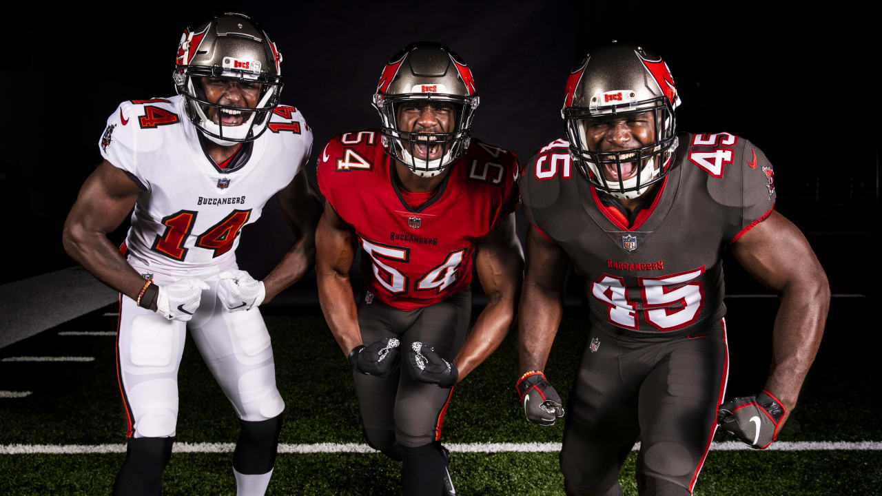
The Positives: First, its not the previous look. The new design is cleaned up and takes on the look of the team that won the Super Bowl in 2002. While I'd love for the Bucco-Bruce logo to come back, this will have to do. I really like the all-white uniforms and I hope they allow for more combos between the jerseys and pants. Additionally, while I normally don't like the lettering on the front of a jersey, this actually works. The stripes on the pants work well for the uniform and there's no annoying armpit striping which looks awful.
 |
| Much better! |
The Negatives: First, I'm not a fan of the over-sized logo on the helmet. I think a return to the helmets from the Super Bowl era would have been a better look. The logo reminds me of the horrible over-sized logos on the Boise State helmets. Shrinking the logo would do a world of good. Finally, I'm not a fan of the dark grey look. Using it for the pants is fine, but the full dark grey look is a bit overkill.
Final Verdict: This look is a massive improvement on the mess of the last few years. It's cleaned up and professional looking again. While most nostalgists (including myself) would love to see the return of Bucco-Bruce, this will have to do for now. Hopefully, the league lifts the moronic one helmet rule and the Bucs can bring back some throwbacks. It's not a spectacular redesign, but it does the job and it's far better than what they wore. Tom Brady will look good in it.
Grade: B

No comments:
Post a Comment