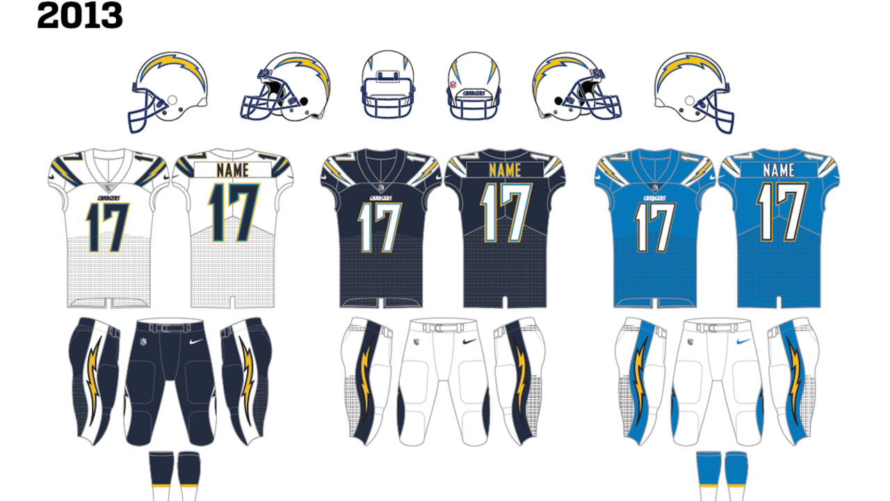
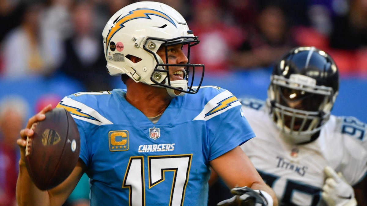
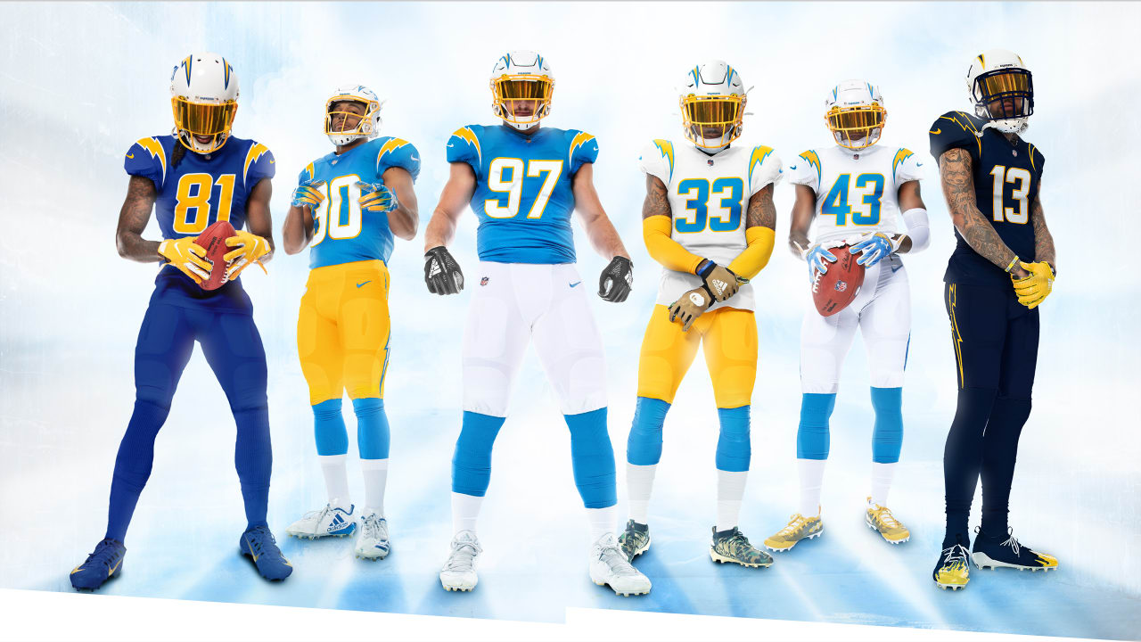
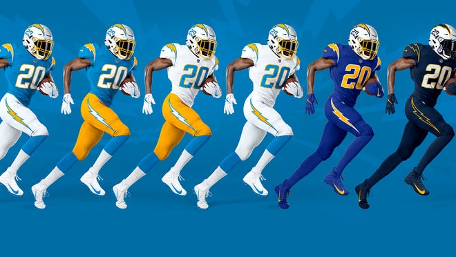
I wish I could say I was saving the best for last, but the Los Angeles Rams keep dragging their feel in unveiling their new uniforms. However, the Chargers; who've always had a solid look, have outdone themselves. In their newest rendition, the Chargers take us on a journey through their uniform past. They have added numbers to the helmets which match the font of the uniforms. The numbers bring back a modernized retro look, which I am a huge fan of. Furthermore, the combo choices display the looks the Chargers had from their inception in 1960, to the present day. The powder blue and yellow, the royal blue, then the navy blue of the late 80s and into the 2000s. There aren't many teams that can say they've never had a horrible uniform, the Chargers can. Have they been perfect throughout their history? Absolutely not. Their previous jerseys had the shoulder stripe with the lightning bolt that just didn't mesh well with the entire ensamble. If that's the biggest complaint about their uniform history, they've had a good run.


The Positives: Just about everything. I love the white helmet with yellow facemask and the numbers. The panys are fanstastic with the simple lightning bolts with fit the color of the pants. The color combos are awesome and their attention to their uniform history is something that I am really big on. It's hard to have complaints about how they went about their look. Additionally, I like the options they have. Finally, the way they match the lightnight bolt on the helmet to the uniform combo is fantastic. Everything works!
The Negatives: Do I have to pick something? I guess the navy blue uniforms are my least favorite, but they still look great. It's hard to pick something I don't like.
Final Verdict: The Chargers got it spot on. Everything ties in perfectly. The colors work, they are consistent, they match. While they may go 5-11 or 8-8, at least they'll be stylish!
Grade: A+


No comments:
Post a Comment