Part 1: Atlanta Falcons
 The positives: There aren't many with this revamp. However, the Falcons did one thing well, t
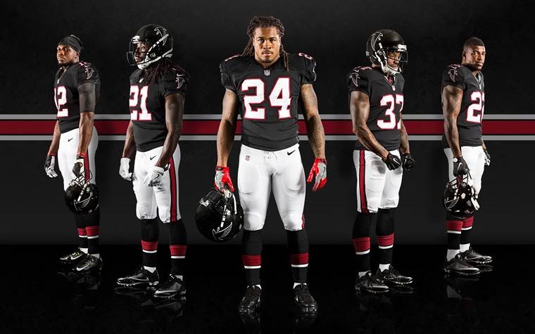
hey brought back they're late 90's black uniform with some updates to it and the old logo. Unfortunately, this is not the primary uniform. I suspect it will be after the NFL minimum 5 year uniform period is up. Next, I'm a big fan of matte black as long as it's used right. Matte black works with a black jersey (see Colorado Buffaloes), in this case it works well for the Falcons. I do like the look with the old Falcons logo.
Furthermore, I know this is a touchy subject among fans, but I'm a big fan of all white uniforms as long as they're done right. The Falcons have the colors to make it work and it would look great if not for the issue stated later on.
Finally, a white jersey with red pants is a solid combo. Unfortunately, the Falcons aren't allowed to add a red helmet to the mix.
The Falcons have great colors and fortunately, they didn't change them much.
/cdn.vox-cdn.com/uploads/chorus_image/image/66627584/uni7.0.png) The Negatives: Where to start. The Atlanta Falcons had the opportunity to resurrect a great look from their early Fulton County Stadium days. The red helmets, jerseys and grey pants weren't tied to much success (then again, it's the Falcons we're talking about), but it was a clean, professional look. These could have been modernized a bit, but it would have been a fantastic update. Unfortunately, they decided to go with a look has me shaking my head. Let's start with the "ATL" splashed across the front, this looks like something you'd see in college football and half the time, the colleges find ways to make it look terrible. Unfortunately for the Falcons and their fans, it makes the uniform look very amateur. Furthermore, the side striping looks bad. Striping is fine on pants but, it needs to stop where the jersey begins (looking at you too, Denver Broncos).
The Negatives: Where to start. The Atlanta Falcons had the opportunity to resurrect a great look from their early Fulton County Stadium days. The red helmets, jerseys and grey pants weren't tied to much success (then again, it's the Falcons we're talking about), but it was a clean, professional look. These could have been modernized a bit, but it would have been a fantastic update. Unfortunately, they decided to go with a look has me shaking my head. Let's start with the "ATL" splashed across the front, this looks like something you'd see in college football and half the time, the colleges find ways to make it look terrible. Unfortunately for the Falcons and their fans, it makes the uniform look very amateur. Furthermore, the side striping looks bad. Striping is fine on pants but, it needs to stop where the jersey begins (looking at you too, Denver Broncos).Finally, the alternate red fade uniform just doesn't work. Again, it looks amateur and more like something a college would try, not a NFL franchise.
As stated before, the Falcons have great colors, unfortunately, they missed the mark this time around...especially with the red fade.
General NFL Negative: I'm not sure how restricting teams to one helmet is safer, but it's annoying. Allowing teams to have just one extra helmet would make a world of difference in the NFL and open the options for teams to have true throwbacks or just a different color to go with the rest of the scheme. These Falcons uniforms would look better with the added options of a red or even a white helmet. I'm not saying that the NFL should allow teams to go full Oregon, but a bit of variety is nice.
 Final Verdict: While the Falcons needed a revamp, I don't think this is what fans had in mind. The striping and the ATL on the front give the uniforms a bad college football look, not a professional appearance. While the colors are great, this update leaves a lot to be desired.
Grade: D+
Part 2: Cleveland Browns....Coming soon
No comments:
Post a Comment