 |
| WTF? |
Throughout their history, the Cleveland, then Los Angeles, then St. Louis and then back the LA Rams have had a decent uniform history. Even the navy blue and gold of the 2000's wasn't a terrible look. Since their move back the LA, the Rams have sought to bring back their original colors. They've toyed with the white logo on the helmet and the blue and yellow of the 80s and 90s. The Blue and yellow look is what they went to two Super Bowls in and won one of them. So when the Rams started to transition to that color scheme, I was excited. They released their new logo which was disappointing to say the least, and now they have released their new uniforms, uniforms they'll have to wear for five years, five years. The LA Rams have joined the Atlanta Falcons in designing uniforms that should go in the bin marked: "Shit that didn't work". The new uniforms feature the blue and yellow, however, the helmet logo has changed to a new ram horn design, the numbers are a gradient style on the blue uniforms which transitions from yellow to white and the road uniforms are an off-white with blue numbers. While the Rams have a great color combo and a uniform history that could easily be modernized or replicated, they decided to unveil something that looks like a bad attempt at designing a uniform on Madden create a team mode.
The Positives: There's not much to like here. I guess the colors of the home uniform. It's a great color combo. That's about it.
The Negatives: Ugh, where do I start? The uniform looks like a horrible mid-major college uniform. These uniforms make the Atlanta Falcons new uniforms look amazing. The off white road uniform is abysmal and the helmet logo looks like that accidentally cut the stickers in half. Additionally, the 'Los Angeles Rams" patches on the jerseys look horribly out of place. Even the striping looks horrible. There's really not much to like about these uniforms.
 |
| SMDH |
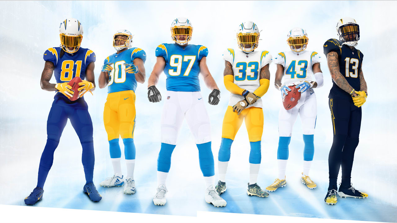
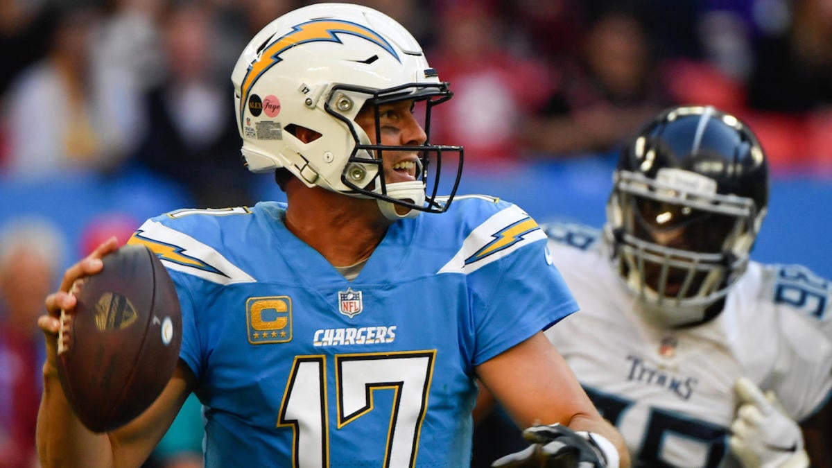
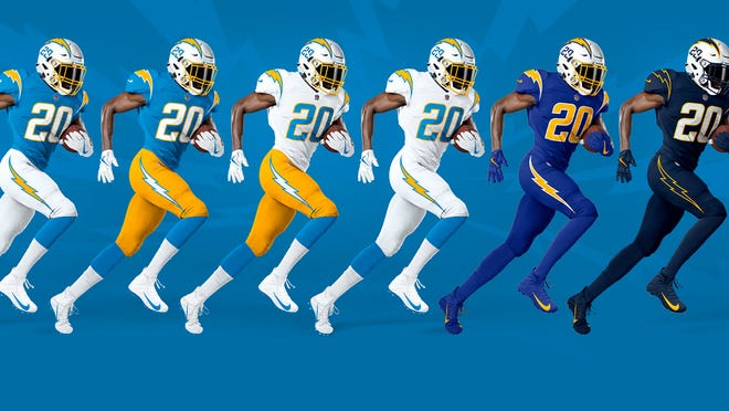
Final Thoughts: While their neighbors from the AFC came out with an outstanding new uniform combo, the Rams did the exact opposite. This uniform looks like a cheap chinese knock off you find at a flea market. It's poorly put together and I think the reason it took so long to unveil it was because they knew people would find it revolting. The replies to their twitter announcement have made for some fun reading. Hopefully in 5 years, these uniforms are given the same send off the Broncos' vertically striped socks got in 1962, thrown into a huge pile on the 50-yard line, doused in gasoline and set ablaze.
Grade: F


